I’m not a UX expert (we have real ones at TCG), but I watched a video breaking down some psychology principles that top designers use, and couldn’t stop thinking about how I am happily influenced by them. Since we build forms, portals, and applications, I wondered if we should be more explicit in their use (and in our UX descriptions in our proposals).
Here are the six principles with some real-world examples:
1. Smart Defaults (Combating Decision Fatigue)

Every blank field on a form is a decision. Stack enough of them up front and people don’t make a choice at all, they just leave. Psychologists call this decision fatigue, and in most products, 70-90% of users never touch a default value. A well-chosen default reads as a recommendation.
- The Jam Study: In the original 2000 study by Iyengar (Columbia) and Lepper (Stanford), a grocery store display of 24 jam flavors stopped more shoppers, but only 3% bought. Cut the display to six flavors, and fewer people stopped, but 30% bought. More options isn’t more helpful. It’s more friction.
- Closer to Home: The UK’s GOV.UK Design System bakes this in directly. Their own guidance tells teams to know why they’re asking every question and cut anything that isn’t essential, part of a broader effort to make GOV.UK forms quick to complete. Form-conversion research backs it up too: completion rates drop sharply once a form passes 5-7 fields.
Pre-select the most common answer wherever you can defend it. Don’t make someone think when you already know the likely answer.
2. The Goal Gradient Effect

People move faster toward a finish line the closer they feel to it, and as designers, we get to choose where the starting line is.
- The Car Wash Study: In Kivetz, Urminsky, and Zheng’s 2006 field study, one group of customers got a loyalty card with eight empty stamps. Another got a card with ten stamps, two already filled in. Both required the same eight washes to earn a free one. The group that started “ahead” finished at nearly double the rate.
- LinkedIn Knows This: Your profile strength meter never starts at 0%. The effect is documented well enough in UX literature that it’s become a default assumption in onboarding design: show 20% done with step one already checked, not “0 of 5 complete.”
Multi-step intake wizards (benefits screening, license renewals, application portals) are exactly the kind of flow where an artificial head start, say, crediting someone for verifying their identity before the “real” form even starts, could change completion rates.
3. Reciprocity
Most apps ask for something before giving anything: “sign up to see your results,” “create an account to continue.” The user hasn’t gotten value yet, and the app already wants something back. This is Cialdini’s reciprocity principle: when someone gives you something first, you feel an unconscious pull to give something back. Give real value before you ask for the sign-up.
- Who Does This Well: Costco hands out free samples. Spotify gives 30 days of premium. Notion lets you use the full product before you pay. None of that is generosity for its own sake. It’s strategy.
- For Us: An eligibility checker or wait-time estimate that gives a citizen a real, useful answer before asking them to create an account is reciprocity in action. It’s also just more respectful of someone’s time, which matters more when the “customer” didn’t choose to be one.
4. The IKEA Effect & Endowment Effect
People value things more when they had a hand in building them, even a small hand. Just feeling like something is “yours” raises its value. A signup page that only asks for an email and password has nothing on it that belongs to the user yet, so there’s nothing to lose by closing the tab.
- The Original Study: Norton, Mochon, and Ariely had people assemble their own IKEA boxes, fold origami, and build Lego sets. Participants valued their own amateurish creations nearly as much as an expert’s work, but only when they actually finished the task.
- Duolingo’s Version: You pick a language, set a goal, and finish a lesson before it ever asks you to create an account. By the time the signup screen shows up, you’ve already invested ten minutes you don’t want to throw away.
The same logic applies to guided intake. Letting someone choose a category, answer a couple of easy questions, or build a personalized checklist before asking for their personal information turns a cold form into something they’ve already started building.
5. Loss Aversion & Status Quo Bias
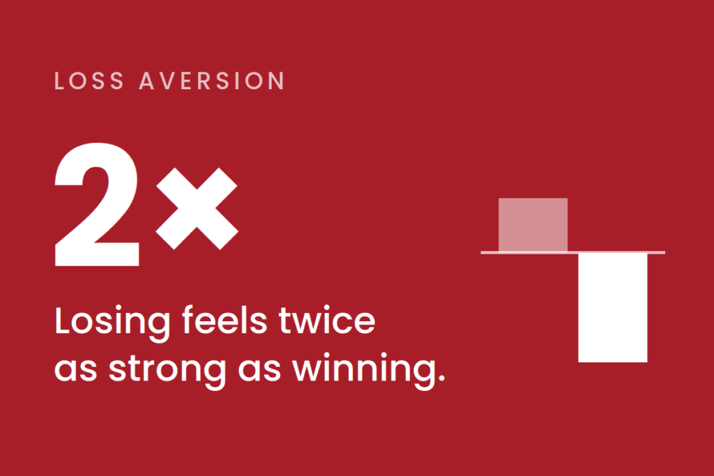
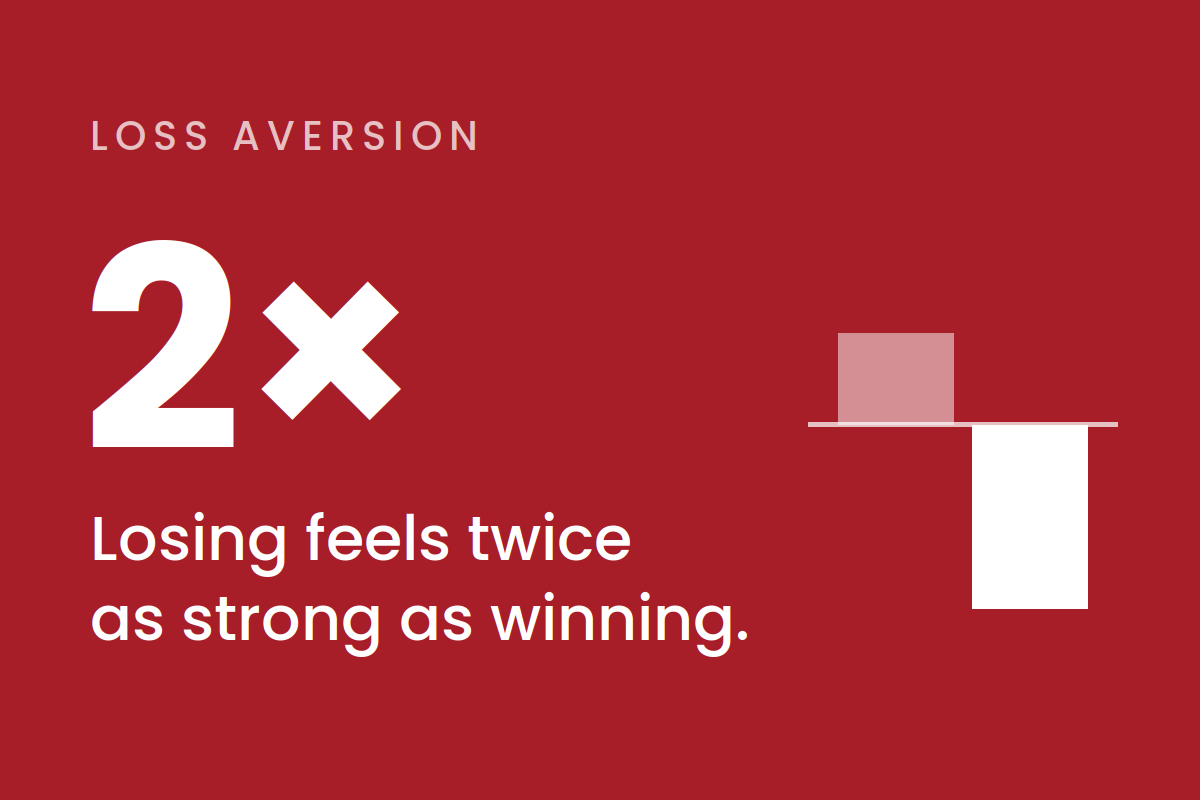
Daniel Kahneman won the 2002 Nobel Memorial Prize in Economic Sciences largely for prospect theory, and its central finding is blunt: losing something feels about twice as powerful, psychologically, as gaining the same thing. Frame a feature as a pure gain, and “maybe later” costs the user nothing to tap. Show exactly what someone stands to lose instead (specific files, a specific deadline), and the calculus changes.
- Not Just a Private-Sector Trick: The UK’s Behavioural Insights Team, the government’s own “Nudge Unit,” has used loss-aversion framing directly in public messaging. Tax-payment reminders, for instance, framed around falling behind rather than simply “pay on time and get X.” It’s one of the more well-documented uses of behavioral science inside a government service, not a private app.
Don’t just sell the gain. Show what’s actually at stake if no action is taken.
6. The Contrast Effect

The same price can feel outrageous or negligible depending entirely on what the user saw right before it. The brain doesn’t evaluate cost in isolation. It evaluates cost relative to the last number it saw. A $50/month add-on (for Apple Care+) looks expensive alone. Placed under a $1,900 phone purchase with a “just 2.6%” label, it barely registers.
- The Classics: Restaurants put an expensive Wagyu steak on the menu to make the salmon look reasonable by comparison. Real estate agents show a slightly overpriced house first so the next one feels like a deal.
- A Government Example: NYC’s congestion pricing charges E-ZPass users $9, while drivers without a transponder pay $13.50 to $22.50 for the same trip. Shown side by side, the E-ZPass price looks like the obvious deal. Whether or not that was the intent, it’s the contrast effect at work in a real government fee schedule.
Never present a cost in isolation. Control what the user sees immediately before it.
The Common Thread

Every one of these principles rests on the same idea: people aren’t making perfectly rational, line-by-line evaluations of every screen we put in front of them. If any of our actual UX folks want to tell me where I got this wrong, I’d love to hear it.
Thanks for reading!